The thumbnail safe zone, surface by surface
Every number you find for the YouTube thumbnail safe zone disagrees with the next one, for a simple reason: YouTube has never published one. What can be worked out is where its interface draws, and that turns out to be stable enough to design against.
Why the numbers you find disagree
Search for a thumbnail safe zone and you will get a different rectangle from every result. One says keep everything inside 1100 × 620, another gives a 40-pixel bottom margin, a third draws the box somewhere else entirely.
They disagree because there is nothing to agree with. YouTube documents what a thumbnail file has to be — dimensions, aspect ratio, formats, size limits, all of which are in the size and specs guide — and says nothing about which parts of the frame its own interface will cover. Every safe-zone figure in circulation is somebody's measurement of a moving target.
That does not make the idea useless. The interface elements themselves are stable: they have sat in the same corners for years, and where they sit is observable. What follows is a map of them, and a working rule expressed in percentages rather than pixels, so it survives both a redesign of your canvas and a redesign of theirs. YouTube publishes requirements for the file — resolution, ratio, size, format — and nothing at all about what its own interface then draws on top. Every safe-zone number in circulation, including the ones below, is somebody's measurement.
What actually sits on top of your thumbnail
Four things get drawn over a thumbnail, and they are not equally likely.
| Element | Where | When it appears |
|---|---|---|
| Duration badge | Bottom-right corner | On essentially every long-form thumbnail, everywhere |
| Watched progress bar | Along the bottom edge | Only for viewers who already started the video |
| Live and subtitle badges | Bottom-left corner | On live streams and, on some surfaces, captioned videos |
| Crop | All four edges | Varies by surface and by device |
Note what is not in that list: the title, the channel name and the view count are not overlays. They sit underneath or beside the thumbnail and never cover it — which does not mean they are harmless, as the section on mobile below explains.
The bottom-right corner is the one that always goes
The duration badge is the only element you can count on being there every single time, and it is the reason the bottom-right corner is not usable space.
Its width depends on the length of the video: a five-minute video gets a narrow box, an hour-long one gets a wider box because the string is longer. So the area it eats is not fixed either, which is an argument for reserving generously rather than measuring exactly. Reserve the bottom-right fifth of the width and the bottom sixth of the height and you will be clear of it at any video length.
This is also where a lot of channels put their logo, which is worth saying plainly: a logo in the bottom-right corner is a logo underneath a black box.
The bottom edge, for anyone who came back
The red progress bar appears along the bottom of the thumbnail for viewers who have already watched part of the video. It is thin, but it runs the whole width, and it appears on exactly the audience you most want to bring back — subscribers, people revisiting from history, anyone who left halfway.
It does not cost you much space. It costs you the bottom few per cent of the frame, and it is a good reason not to end a line of text right at the bottom edge, where a red bar under the descenders makes the last word harder to read at tile size.
The edges, because crop is not one thing
The bigger risk is not an overlay at all — it is that the frame you designed is not always the frame that gets shown. The same file appears in a desktop grid card, a mobile feed card, a search result, a suggested-videos row, a channel grid and on a television, and those surfaces do not all treat the edges identically.
You cannot enumerate that with any confidence, because it changes with app versions and screen sizes. What you can do is stop treating the outer band of the frame as design space. Keep the composition inside the central ninety per cent and the differences stop mattering: whatever any given surface trims, it trims background.
The working rule, and a template
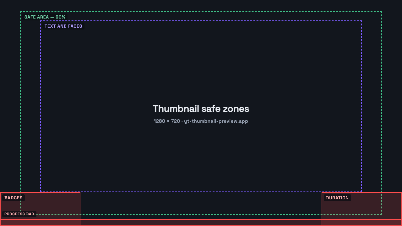
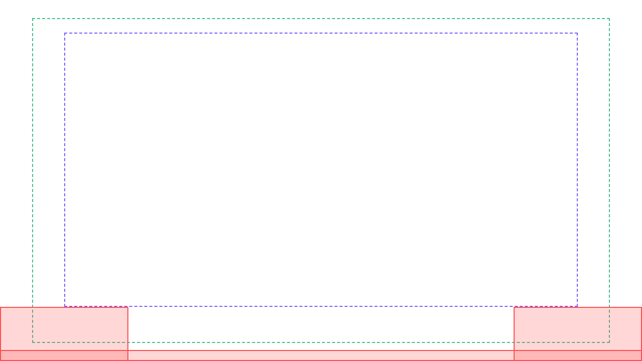
Putting the four together gives a rule that does not depend on a number YouTube never published. On a 1280 × 720 canvas:
- Keep clear — the bottom-right fifth of the width by the bottom sixth of the height, for the duration badge.
- Keep clear — the same block in the bottom-left, for live and subtitle badges.
- Keep clear — the bottom three per cent, the full width, for the progress bar.
- Safe area — the central ninety per cent in both directions absorbs crop differences between surfaces.
- Text and faces — the central eighty per cent by seventy-six, which is what is left once all of the above is respected.
Two templates at 1280 × 720, to check your own work: a labelled reference and a transparent overlay to drop straight over a design in your editor. Both are percentages under the hood, so they scale to any canvas you work at.
Using the corners you cannot use
Reserving those areas does not mean wasting them. The badge sits on top of whatever is underneath it, so the question is only what it sits on top of comfortably.
Background belongs there: sky, a wall, a blurred part of the scene, an area of flat colour. What you want in the bottom corners is something that reads the same whether or not a black box lands on it. A gradient darkening towards the bottom does this well, and has the side benefit of making the duration badge look deliberate instead of dropped on.
What does not belong there is anything the composition depends on — the subject's eyes, the point of a gesture, the end of a headline, a logo. If moving one of those out of the corner makes the layout feel unbalanced, that is usually a sign the layout was built to fill the rectangle rather than to work at tile size.
The title does not cover it, but it takes attention
On mobile the title sits immediately beneath the thumbnail, in bold, at nearly the same width. It covers nothing and still changes the design, because the eye reads the pair as one block.
The practical consequence is that text in the lower third of the thumbnail competes with the title for the same glance, in the same reading position, at almost the same size. If the thumbnail's words repeat the title's words, that competition is also a waste: you have spent the strongest area of the frame saying something the reader is already about to read.
Look at it at the size it will be seen
Every rule here fails the same way in practice: it is followed on a canvas at 100% zoom, where a corner looks enormous and a margin looks wasteful, and the file is then shipped without ever being seen at the size it will actually appear.
A thumbnail in a suggested-videos rail is a fraction of the width you designed it at. At that size, a subject pushed into the corner is not merely covered — it was never legible anyway. Putting your design into a real feed, at real size, is the check that makes the safe zone obvious rather than theoretical, and it takes about a minute in the preview tool.
The mistakes this causes, in order of frequency
Almost every safe-zone failure is one of four, and they are all recoverable before publishing.
- A word of the headline ends in the bottom-right corner, so the last word is under the duration badge.
- A channel logo sits in the bottom-right corner, permanently half-hidden.
- A face is cropped so tight against an edge that a surface trimming a few per cent cuts into it.
- Text is set right to the bottom edge, where the progress bar runs through the descenders for returning viewers.
Shorts are a different frame entirely
None of the above transfers to Shorts. The frame is vertical, the surfaces that show a Shorts thumbnail are not the same ones, and the crop behaves differently — the top and bottom are what gets taken rather than the corners.
If you publish both formats, treat them as two different problems rather than one design resized. The vertical case is covered in the guide on Shorts thumbnails.
Questions people ask about this
Does YouTube publish an official safe zone?
No. It publishes file requirements — dimensions, aspect ratio, formats, size limits — and nothing about which parts of the frame its interface covers. Every safe-zone rectangle you find, including the one here, is derived from observing where the interface draws.
How much of the bottom-right corner does the duration badge cover?
It varies with the length of the video, because a longer duration is a longer string in a wider box. Reserving the bottom-right fifth of the width by the bottom sixth of the height clears it at any length.
Does the progress bar appear for everyone?
No, only for viewers who have already watched part of the video. That still includes a lot of the audience you care most about, and it always runs along the bottom edge.
Is the safe zone the same on mobile and desktop?
The overlays sit in the same places. What differs is the crop at the edges and the size the thumbnail is shown at, which is why the rule here is a percentage of the frame rather than a pixel margin.
Do the same rules apply to Shorts thumbnails?
No. Shorts use a vertical frame, appear on different surfaces, and lose the top and bottom rather than the corners.